WELCOME TO SCALABILITI
We're a UK Collective, doing our bit to help increase that distribution, by bringing the future that already exists to a wider audience.
London Tech Jobs at Career 2.0
- An error occurred while fetching this feed: http://careers.stackoverflow.com/jobs/feed?searchTerm=&location=London&range=20&ajax=1
TAG CLOUD
Who saw AAPLs market cap exceeding MSFT?
Predctions when looking backwards are rarely wrong, unless you want them to be. With that in mind, Apples' eventual overtaking of Microsoft in the market capitalization stakes was seen enviable by many. But was there any indication that is was so pre-determined?
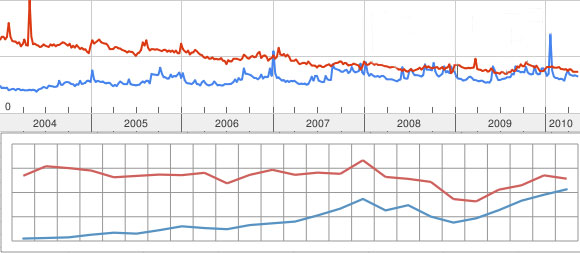
Take a look at the graph below. Interesting correlation between the two I think.
But what's the data between the two graphs, and where did they come from?
One of the areas that we've been interested in recently in semantic analysis of written data. This could be articles, blog posts, tweets or status updates. They each require a different level of analysis, from the word level for tweets, to sentence and paragraph analysis for articles. One of interesting resources we've used is Google Trends.
Grown from the original Google Zeitgeist data that Google publishes each year, Trends allows you to see search results (based on actual search queries) for competing keywords. The top chart above is from Google Trends, based on a search of “apple, microsoft”. You can see the live results by following this link.
The bottom chart, as you've probably guessed by now, is the historical market capitalisation for both companies over the same period.
It's not really empirical as such, but it a very nice display of sentiment, a data point that's very difficult to measure. We're wondering if there is a way in which this information could be used to help predict the momentum of companies, and it's something we're looking into further.
Have a play with Google Trends, and see if you spot the next 'big' thing. If you do, don't forget to drop us a note straight away!
Feedback and comments welcome to steven.algieri@scalabiliti.com


